I love me some Doctor Who. It was just a matter of time before I merged Buzz Lightyear with the Doctor. David Tennant and Buzz have the same eyebrows after all.
This Buzz says, “That wasn’t time travel… it was falling, with style.”
Here are a few more amazing examples of Buzz Lightyear fan art from our readers.
Renaissance Buzz Lightyear by Matthew Sargant
Great work Matt! Love the wings, the puffy shirt, those boots! Excellent.
White Board Buzz Lightyear by Chris
Does it make me weird if I really like his eyes? Nice touch on crosshatching the blue and red dry erase markers to make purple.
Buff Lightyear by Wallace
This was inked on paper, scanned and colored in Photoshop by my friend and co-worker Wallace Phare. I love that the muscles are so huge they literally take the place of the armor!
I’d love to feature your Buzz Lightyear fan art here…
Here before you is a Buzz Lightyear made from french fries… the healthy part of this balanced breakfast! This was actually an idea given to me by my 6 year-old daughter, Jenna. She was visiting family and did a portrait of her Uncle Tim using her french fries. She’s awesome. She actually does her own podcast for kids. Check it out.
This Buzz says, “Help me. Once he’s done with this photo he’s going to eat me!”
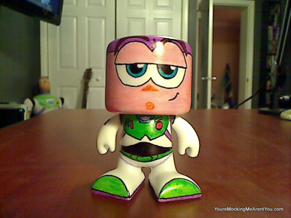
I was shopping at Target for some Kit-Kat bars and ran into an end cap with these Color Blanks figures from RoseArt. Two of them come in a pack for just under 10 bucks. They reminded me of the Munny or Mighty Mugg figures… except a few bucks cheaper.
I bought one pack and a bunch of permanent markers and knocked this out Sunday afternoon. I highly suggest you go out and pick a pack up yourself and create something awesome!
This Buzz says, “I could have been shaped like a bird, a dog or have had a square head!”
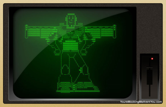
I made this using Notepad and a keyboard… then Photoshop. I would have liked to have added the actual ASCII art… but apparently my theme adds css style formatting to the pre tag that makes that impossible. Boo.
If anyone knows a way, I would love to share the actual text. Be sure to click the image to make it bigger.
This Buzz says, “I would look better in Windows 3.0.”
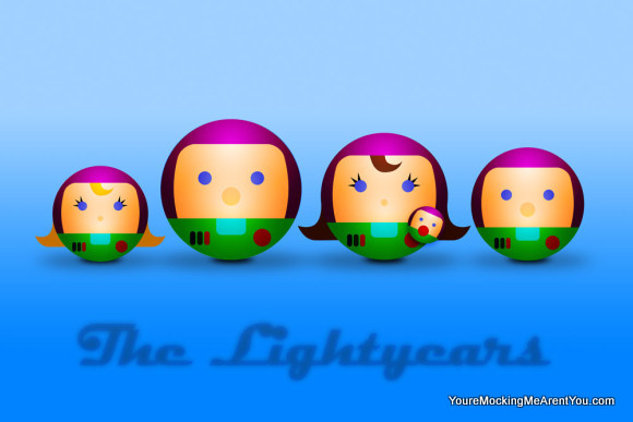
Every hero needs a family to come home to. Even if you’ve been simplified into a sphere.
This Buzz says, “Why did we all have to wear matching outfits hon? It’s so cheesy.”
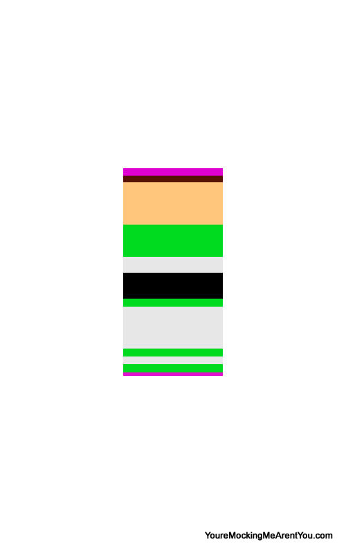
If I were you looking at this I’d be saying, “Looks like he’s running out of ideas already.” But I assure you that is not the case. I was inspired to do this abstract Buzz after seeing some Street Fighter Abstracts over at infinitecontinues.net. The idea behind the originals is that the characters were so regognizable that you’d know who they were even without any detail… just the colors. I wanted to see if I could do the same thing with Buzz Ligtheyar. So there you go. How did we do?
This Buzz says, “This is what I’d look like if De Stijl painted me. Thank God for Pixar!”
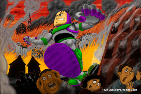
A giant 50-foot Buzz smashing his way through the city. Was he created by some random blast of radiation? Is he a robot created by Zurg? Is this all just a dream? I don’t know… but I think I hear the Power Puff Girls theme song.
This Buzz says, “Buzz SMASH!!!”
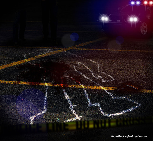
Buzz has been killed! OMG!!!!!
This is (obviously) a Photoshop job… built with images, layers and filters.
This Buzz says, “…”
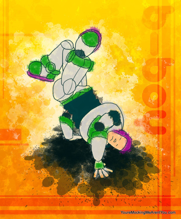
Going for an 80’s vibe with this one. It’s in honor of all my peeps back in KCMO! YOU KNOW!
This Buzz says, “This isn’t dancing… it’s moving, with style!”